Responsive design is a method of designing and building websites that allows them to adapt to different screen sizes and devices. With the increasing use of smartphones and tablets to access the internet, it has become crucial for websites to be able to adjust their layout and functionality to provide an optimal user experience on all devices. The question “What does responsive design mean” is the focus of this article, In this article, we will explore the concept of responsive design in more detail, including its benefits and best practices for implementing it on your own website. Whether you’re a web designer, developer, or just someone interested in the latest web design trends, this article will provide a comprehensive overview of what responsive design is and how it can be used to improve the user experience on your website.
What Does Responsive Design Mean? Answer here.
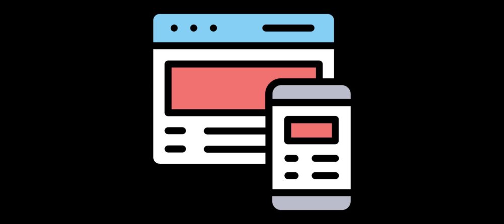
The primary idea behind responsive web design is to have a website appropriately adjust for the device the visitor is using. Whether the website visitor is on a mobile phone, tablet, or desktop, the website should be able to respond appropriately.
However, not all phones, tablets, and computers are made equal so the responsive design must go a bit further than simply adapting to the device itself. Screen sizes can vary widely and what happens if a user decides to flip their phone in portrait mode? What happens when they zoom in and out?
Text, images, buttons, content, and more needs to be able to respond to the user’s actions in order to make the website visitors as positive and easy as possible. Everyone wants a clean and easy to use the website.
Besides grabbing the nearest phone or tablet, you can check what your website looks like on various devices from your own computer.
1. Press F12 (if on Chrome) to open up the developer tools
2. Select the following option in the developer tools menu
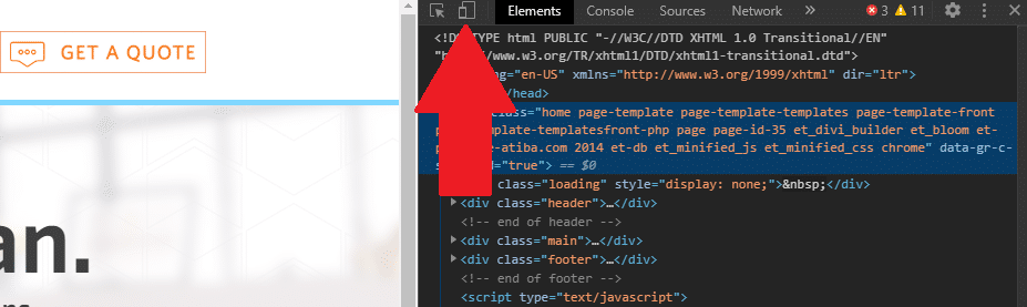
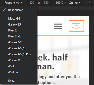
3. From there, you can check out what your site looks like on various devices, resolutions, and even in portrait mode.
It’s fairly simple to do and can give you a quick check on your site’s performance.
The ultimate goal is to make browsing a website as seamless and flexible as possible, no matter what device is in the hands of the users.
The Benefits of Responsive Design for Websites
| Benefit | Description |
|---|---|
| Improved User Experience | Ensures consistent and seamless user experience across all devices, including mobile, tablet, and desktop. |
| Increased Mobile Traffic | Attracts and retains mobile users by optimizing content and layout for smaller screens. |
| Cost Efficiency | Eliminates the need to maintain separate websites for desktop and mobile users. |
| SEO Benefits | Responsive design is recommended by search engines like Google, improving rankings and discoverability. |
| Faster Loading Times | Optimized designs often lead to faster page loading on various devices, enhancing performance. |
| Adaptability to Devices | Automatically adjusts layout and content based on screen size, providing flexibility for new devices. |
| Higher Conversion Rates | Improved usability and accessibility can lead to better engagement and increased sales or sign-ups. |
| Simpler Analytics | Unified tracking and reporting make it easier to monitor user behavior across all devices. |
| Future-Proofing | Prepares websites for evolving technology and emerging devices with varying screen sizes. |
| Brand Consistency | Maintains a uniform look and feel across devices, strengthening brand identity and trust. |
Mobile-Friendly vs. Responsive Design
From the outside, it’s easy to get these terms confused so let’s run over them quickly.
Mobile-friendly refers to a website having a mobile version for their website. Pretty much every website out there has a mobile-friendly version. You’d really have to crawl through the depths of the internet to find a website that isn’t mobile-friendly.
What makes responsive design unique is the ability of the website to adapt to the user’s actions and device. That means making sure it adapts to portrait view, various mobile devices, and zooming in and out.
Pictures should be optimized, buttons need to be easily clickable, and text needs to be readable. It’s not hard to make a site mobile-friendly but it can be a challenge to have the right responsive design. Don’t make the mistake of thinking that your site is responsive just because it’s mobile-friendly.
Mobile-First Indexing
Finding someone without a smartphone is about as tough as it was finding someone with a smartphone 10+ years ago. They’re used for everything these days, like looking up cute cat photos, laughing at memes, or checking the latest sports scores.
That’s almost unbelievable, a 222% rise in mobile traffic over the last seven years!
Such a drastic shift to mobile search caught the attention of Google, who officially switched to mobile-first indexing back in July of 2019.
What exactly does this mean? Let’s hear what Google has to say:
“Mobile-first indexing means Google predominantly uses the mobile version of the content for indexing and ranking. Historically, the index primarily used the desktop version of a page’s content when evaluating the relevance of a page to a user’s query.”
Basically, Google is going to be looking at your mobile site before they check out your desktop site.
Google uses their smartphone crawler tool to judge a website’s mobile usability and functionality. If you haven’t already, you can check your Google Search Console to see when your website officially switched to mobile-first indexing. If you don’t see any notice, it’s likely because the switch happened months ago and you unknowingly clicked by the message.
So, what happens if you don’t have a proper mobile website? The answer is both easy and bleak: you’re going to start slipping in the rankings.
Having your visibility drop could cost you valuable clicks which eventually leads to a loss of conversions and customers. All the work you put into boosting your rankings and local SEO could end up being for nothing. Ensuring you have proper responsive design means a mobile-friendly site which equals a better chance of moving up the rankings.
Mobile Usability
If you’re someone who regularly checks Google Search Console (which you should be doing anyway), then you might already be somewhat familiar with the Mobile Usability option on the sidebar.
The mobile usability tab will show you how Google views the mobile version of your website. It goes a bit further than simply double-checking that your site adheres to their mobile guidelines. For example, it will tell you which pages pass the test and which pages, if any, have errors on them.
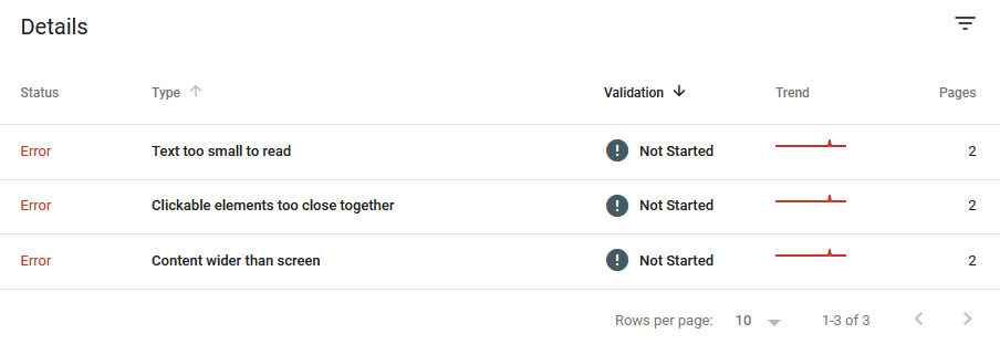
This relatively new feature is incredibly handy when checking your website and ensuring it ticks all the right boxes. You might have to hand some things off to your web developer to ensure that these issues are taken care of and don’t harm your rankings with Google.
What Google Search Engine Team Says About Responsive Website Design

When it comes to world secrets, Google’s algorithm is up there along with the recipe for Coke and what really happens at Area 51. While Google employees will often host webinars to answer questions and dispel any myths, they never give away the whole pie.
We do know, however, when an update comes out. The results pages see high volatility for a few weeks before everything (somewhat) settles down. The most recent update was the May 4th update which saw high volatility in industries like travel and real estate.
Google is always nice enough to warn people about the updates, as they’ve done with the 2021 update that focuses on page experience. Page experience will now play a role in ranking.
What goes into “page experience”? Google has listed out a number of core vitals, which are:
- Mobile-friendly
- Safe and secure browsing
- Loading performance
- Interactivity
- Cumulative layout shift
But what does this have to do with responsive web design?
Sites that have responsive design load faster and are more likely to have minimal layout shifts.
Cumulative layout shift (CLS) is a new metric that ensures if the page is stable during loading. It seeks to find out if buttons, images, text, ads, and more move during loading. If you’ve ever tried to push a button on a website only to have it move at the last second, you’ve experienced a negative layout shift.
Proper responsive web design can ensure all those images, buttons, and more are stable during loading. Sometimes, fixing those issues can be difficult which is why having an experienced web developer is key for moments such as this.
Responsive Web Design Equals Positive User Experience
Another Google tool that you should be making use of is Google Analytics. There, you can find statistics on how people found your website, how long they stay on your website, and which pages they visit.
It can also tell you the bounce rate of your visitors, or the percentage of people who enter your site and leave after visiting just one page.
Having a high bounce rate isn’t always a bad thing. If you see an informative blog or content piece that has a high bounce rate, that may be normal. Visitors visit the page, get the information they want, and then leave. It’s not the worst thing in the world, nor does it have an effect on how Google sees your website.

If you’re running an eCommerce site, however, then having a high bounce rate could mean users aren’t browsing your store or checking out products.
It can be difficult to track exactly why users are bouncing off, but the poor user experience is often one of the leading causes.
Page load time, for example, has a direct effect on bounce rate according to a 2018 study by Pingdom.
A slow web page or page that has a lot of shifting content is going to frustrate users and they’ll leave before they read your blog, check out the store, or browse around.
It’s like owning a storefront and having the front door accidentally locked during opening hours, not displaying product prices, or being absent behind the register. Basic things that should be taken care of are already shooting you in the foot.
By ensuring your website uses responsive design, you’re providing a positive user experience to your visitors. They may not end up a conversion, but you’re giving yourself a better chance at success by following sound tactics.
Proper responsive web design is more than just picking the right theme for your website. You need experienced developers who can tackle any problem and make sure your website fulfills all the necessary requirements for not just Google, but your visitors as well.
If you’re looking at improving your web design, reach out to us today for a project quote. We look forward to working with you.