
First impressions matter for your business. A firm handshake, proper eye contact, and a pleasant introduction are necessary for an initial introduction. When customers walk into your store, many expect to be greeted and offered immediate assistance.
As more and more client interactions move to the online world, how do you make sure you keep giving a solid first impression?
Your website.
Your website is the first point of contact most consumers will have with your business. They may see your business listed on Google Maps or hear about you through a friend, but their first true interaction maybe when they come to your site.
Having an old, outdated website is a surefire way to lose customer interest.
When it comes to making the ideal website, there are plenty of common mistakes you can avoid.
Not Having a Website
The first mistake we often see businesses make is simply not having a website. Yes, you can get online exposure through Google Maps, Facebook, Instagram, and other platforms, but is that what your audience uses?

Social networks like Instagram and Facebook often require visitors to create an account to view a page. What if users don’t have an account? They’re likely to leave and go look for something else.
Having a website is an agnostic way to reach everyone on every device.
Too Much Action
Critics of the Star Wars prequels, Episodes I, II, and III, often talked about how dense and overwhelming some of the scenes were. With director George Lucas’s love for CGI, so many scenes were stuffed with exploding droids, lightsabers, and more than the human eye could take in.
The same can happen with your website. Many times, websites have too much going on that distracts the user from what they’re supposed to do. Bright colors, pop-ups, and confusion are a way to ensure the user is confused and will eventually leave before clicking around.
Hard-to-Find Contact Information
You don’t need to be told that your contact information is important. In fact, your name, address, and phone number are what users often seek out from the beginning. Plus, your NAP is vital to local SEO as well.
Don’t bury your contact information in the footer or on a hard-to-reach page. Make a clear button that instantly tells users how they can contact you. Put your contact page in the top menu so users can navigate there with a single click.
Ad Overload
While brick-and-mortar businesses may not be running ads on their website, plenty of eCommerce stores and other websites need ads to survive. Ads are a double-edged sword. On one hand, they provide you with revenue to pay for costs. On the other hand, they can slow your website down and interfere with your overall layout.
This isn’t Times Square.
Ads that consistently pop up over content or are too flashy can distract and frustrate users, causing them to leave before they’ve done anything on your site. Ads may be necessary, but they don’t have to dominate your site.
Over-Reliance on Stock Photos
When it comes to putting photos on your website, it’s best to have original photos from your business. If you can’t take your own photos, then you might be tempted to go with stock photos.
Another necessary evil of the web design world, stock photos are easy to find and put on your website. They look professional but they can also look cheesy and fake.
Are your workers really fist-bumping each other every day? Are people often laughing around a computer? Is everyone perfectly dressed and always looking pensive?
If you can, try to get your own photos. This might be difficult in times of COVID, but once you’re able to safely take your own photos, head down that route.
Incorrect Image Sizing
Images that are too big can cause loading problems and make your content and other options hard to see. Images that are too small lose their purpose as no one can see what they really are.
You also want to be aware of image stretching or shrinking, as distorted images can cause a poor user experience.
Too Many Options
When users visit your website, where are you trying to lead them to? Are there specific service pages you want them to visit? Should they go to your location page? Are there multiple pages?
It’s a good rule of thumb to have no more than five options for users from your homepage. When thinking about what you should have, think of the basic questions:
- Who are we?
- What do we do?
- How can we help?
Overloading your viewers with options is confusing and they’re more likely to not click on anything instead of being sent to a certain page. Make it obvious for your users.
A Slow Website
We’re used to things being instantaneous in our lives. We can order food from our phones, buy whatever item we can think of in an instant, and even book a trip around the world in a few minutes. Slow websites can lead to a loss in conversions, fewer page views, and a decrease in overall customer satisfaction.
Users expect a website to load and respond quickly. If your website is bringing up the rear at a snail’s pace, users are going to leave before they even see your homepage. There are plenty of reasons why your website is slow, and some of them cross the line between web design and web development. But that doesn’t mean you can’t be thinking about the best practices from the start.
Infinite Scroll
Infinite scroll, the scroll that just keeps going and going and going and going. You’ll never reach the bottom of the page because there is no end.
Infinite scroll may seem nifty, but it’s actually damaging for your SEO and can hurt the overall user experience. It’s best to stick to pagination as it will help your users know where to go and how to get there.
Not Starting With Mobile Design
When designing your website, you should start with the mobile site first. More than 50% of the world’s internet traffic comes from mobile devices and Google has switched to mobile-first indexing, meaning they’re going to be looking at your mobile site before taking a look at your desktop site.
Start with your mobile design first before moving to the other versions. Google and your users will thank you for it.
Not Updating Your Site
Your site shouldn’t be a one-off project where you upload it to the internet and then never worry about it again.
The internet, content guidelines, Google’s guidelines, and more can change over the years. Be sure to monitor these changes and adjust your site accordingly. Update your content when necessary or look at a new redesign if your site has been around for longer than five years.
Hidden Calls to Action
Having hidden calls to action (or no calls to action) is like forgetting to put on shoes before a race. You’re there and ready, but how do you expect to compete?
The best practice for your calls to action is to have them above the fold. What does that mean? Check out this example from the American Airlines website.
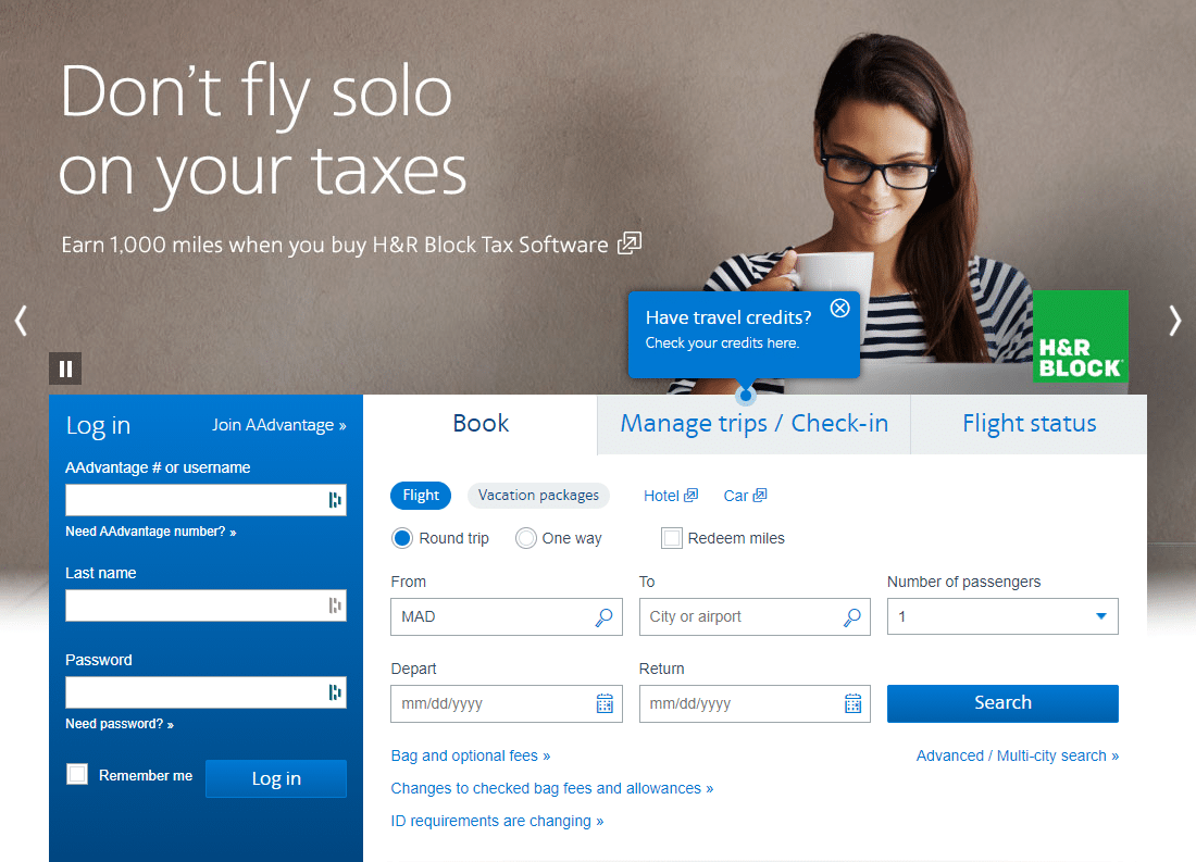
The fold is a point on your webpage and represents what’s initially visible when users come to your site. You want to put your most important items above that fold so they’re immediately visible to users.
You can see that the login information is immediately available as is the option to book a flight, manage your trips, and more. In the background, they have a slider with various promotions or announcements for the user to check out.
If American Airlines had put this information below the fold, users might be frustrated at their inability to make a reservation or log in.
Multiple Calls to Action
Do you remember when you were younger and your mom would constantly add chore after chore to your to-do list? Which item should you do first? Feed the dog or water the plants? Make the bed or fold the laundry?
Remember, your visitors want something easy. Trying to get them to sign up for your newsletter, fill out a contact form, or register for a free offer all at the same time likely means you’ll be going 0 for 3 on your asks.
Instead, go after the most important item first. You can always ask for additional things later but just stick to the basic and most important now.
Not Linking to Your Social Accounts
Linking to your social accounts is a way to build up your social following and also establish a level of trust. Businesses that don’t have some kind of social account seem ancient and caught in the past.
You can also open up the options for users to share your content or updates immediately on their social accounts. This can easily connect you and your business to more potential consumers.
Hiding Your Money Pages
More often than not, we see websites have their “money” pages tucked away somewhere on the site. The “contact us” page is buried somewhere on the Meet the Team page or your register page is behind layers of other pages.
Don’t make your users hack through the weeds with a machete. Take them to the point they need to be and make the journey as easy as possible.
Choosing a Font That’s Hard to Read
People come to your site looking for clear information. They won’t be able to find or understand that information if they can’t read it.
Does this look easy to read?
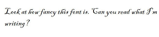
Sure, your brain can reach back to third-grade cursive, but this text is far from easy to read.
Fonts that are overly difficult to read decrease what’s called cognitive fluency which can hurt decision making. When choosing a font, choose a neutral font that’s simple to follow and read.
Some of the most ideal fonts are:
- Open Sans
- Yellowtail
- Arvo
- Helvetica
- Montserrat
- Titillium
- Varela
- Cairo
- Karla
Take a look at those fonts to start and then STICK WITH IT. Having multiple fonts across your site can also be confusing for your users.
Ignoring Whitespace
Whitespace may seem like a negative, but it’s a great way for users to understand and read content more efficiently.
If you have content, images, menus, ads, buttons, pop-ups, etc. all squished together, this is likely to overwhelm the users. Plus, it will make things very difficult to click on.
Instead, use your whitespace effectively. Having page breaks, spaces, and more will help your users comprehend your content better, improve readability, and keep their attention longer.
Links that Don’t Change Colors
Links are a big part of your website, especially when it comes to your content. If you’re trying to direct users to a certain page “Contact Us Today for a Special Offer” or “Click Here to Register!”, users are accustomed to links changing colors.
If your links just look like regular text, that’s going to be confusing and difficult for users to find their way.
Not Planning for Your Audience
Sales and business professionals know that personality or being able to match personalities is a big part of any sales deal. You can’t come in with a huge ball of energy to a notably low-key customer nor can you act overly casual with a customer that’s quite formal and professional.

Your website should also reflect what your target audience wants.
If you’re running a laser tag and trampoline park, it’d be fun to have lots of colors, images, videos, and more to attract families and kids. That same mantra wouldn’t apply for a B2B website in the industrial world.
You might have an idea of what you want your website to be, but it should also be about what your customers are expecting.
Shifting Content
Another problem that crosses both web development and web design, but shifting content can be confusing and annoying for users. What’s worse than trying to click on something only to have it move at the very last second?
Shifting content is part of Google’s Core Web Vitals and having too much shifting content can be detrimental to your website from a rankings perspective.
Not Sticking to Your Brand
As part of your larger overall strategy, you should be thinking about your brand. What kind of personality are you showing to visitors? Your website should be your best brand ambassador and staying consistent is key.
Visitors are going to interact with your brand across different channels, from in-person to social, and having consistent branding makes it easy for them to understand who you are and what you do.
Wrapping it Up
Your website is an extension of your business, your brand ambassador, and your digital first impression. You want to make sure you’re taking the necessary steps to create and craft a beautiful website to attract visitors, keep them around, and make them customers down the road.
Here at Atiba, we offer web design services and have worked with plenty of clients, helping them design websites from the ground up or redesigning an existing website. If you want to know more about our web design services, reach out for your project quote today!